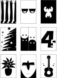
Figure/Ground
Ah, figure/ground. Another beast that likes to fight with me! I suppose I have a love/hate relationship with figure/ground (how fitting). I love it when I see it. I delight in finding the “hidden”. Illusion is great for generating visual interest and keeping people’s attention.
That said, as much as I enjoy figure/ground, I have a hell of a time creating that kind of illusion for myself. In an old project at UMD, we had to create some figure/ground work. It was quite possibly my most difficult assignment that semester.
In design, especially web design, I like to use a lot of negative space. I feel like it helps to highlight the important stuff. Clutter just feels like a mess. If everything is highlighted and says “LOOK AT ME!” then nothing stands out. So the importance of negative space is huge. I’m also a bit of a minimalist when it comes to art and design. My favorite things are usually very minimal and clear. The book mentioned “Artful Reduction”, which is always something I strive for. How can I say the most with using the least?


