Hierarchy
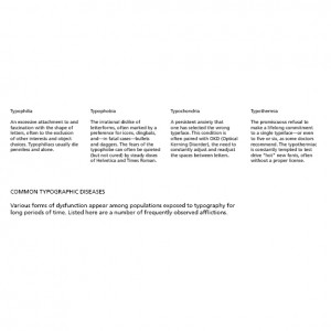
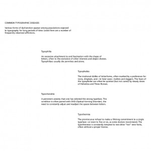
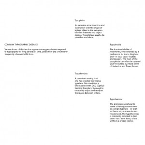
I suppose when I think of hierarchy I’m reminded of a little project I worked on in Typography I. We were all given the same copy and the same grid and had to arrange everything in a way that the hierarchy was clear, and use a bit of creativity so they were visually interesting. We had to use the same font and could not change the weight or styling of it, and we also had to keep the sizing within 1 or 2 points of the main size.
Hierarchy was achieved through use of space around items, flow from top to bottom or left to right, size of type (within 1 or 2 points), use of uppercase and lowercase.
I experimented with the “top to bottom” rule in the first piece I put together by putting the primary info under the secondary info, but setting it as more eye-catching with a larger type and uppercase heading.


