Symbols/Interactivity Project
The final assignment for my Graphic Design I class was to get together in a group and come up with cohesive symbols and eventually work those into a website. My group chose “Duluth Youth Culture” as a theme, with each of the 4 of us coming up with symbols for Music, Dining, Nightlife, and Activities. My symbol was Activities.
I was a bit thrown off at the word “youth”, as I thought it meant children (hi, I’m getting too old! lol). So my original idea of having a soccer ball with the black panels stylized as black handprints didn’t quite make sense. When the group explained they meant youth as in college kids, I had to rethink. We decided we’d do some flat white-on-dark-brown circle icons. I wanted to do something with snowboarding since this is Duluth MN, where it’s winter pretty much always. Unfortunately, the shape of a snowboard doesn’t lend itself to being an obvious symbol, so I went with a ski lift.
![]()
The icons my groupmates came up with:


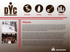
The next part of the assignment is for each person to come up with a web design using our icons and theme. This was mine:

I wanted to do something simple that highlighted the icons. Another groupmate had a more interesting design, and something I could have more fun building, as it had some potentially complicated parts, so I built his. I have that uploaded to angelakoskela.com/GDI
As someone who’s already built many, many… many websites, I made an effort to try some new coding things I haven’t done before. Must take advantage of any opportunity to expand my skills! It was fun coming up with cohesive icons for a single project, and seeing how vastly different our ideas could be, but still come together and work.
