Intro and Point, Line, and Plane
Intro
This sentence stuck out to me on page 8 of “Graphic Design The New Basics” (Lupton and Phillips):
According to postmodernism, which emerged in the 1960s, it is futile to look for inherent meaning in an image or object because people will bring their own cultural biases and personal experiences to the process of interpretation.
I suppose this stood out to me because when “interpreting” any work of art, it often seems what I get out of it and what an art historian or instructor might say it’s about are often very different. I used to think I was “wrong”, but there is always room for interpretation. Knowledge behind the interpretation can certainly be a boost. And there is rarely one right answer.
From page 9:
Software tools provide models of visual media, but they don’t tell us what to make or what to say. It is the designer’s task to produce works that are relevant to living situations (audience, context, program, brief, site) and to deliver meaningful messages and rich, embodied experiences.
This paragraph stuck out to me because one of the things I’ve struggled with working professionally as a designer is getting clients and employers to understand that a designer is not just a “tooler”. We have knowledge and experience and talents to draw upon to create great work—we are not only trained to use the tools at hand and have no value beyond that. We don’t just make pretty pictures using software. There is a lot behind the creating.
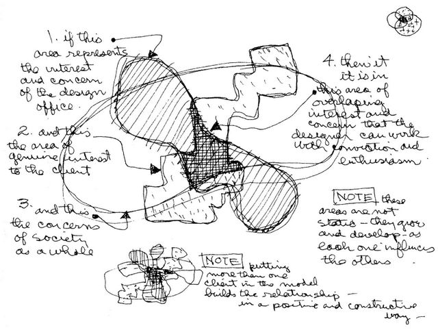
Charles Eames diagram from page 11:
An intriguing way to depict the difficult process of making a project that meets the needs and wants of the client and the designer and the audience (society). I’m not so sure I agree with his last note of putting more than one client into the model being positive and constructive. It’s been my experience that design by committee is always a disaster. Though with proper direction, I imagine it could go much better.
Point, Line, Plane
In design, the most basic building blocks are the point, line, and plane. As a minimalist at heart, being able to break design down into its most basic parts is fascinating. It could also be my web programming background, the need to be able to take everything apart down to its most basic elements. To be able to “trim the fat” and go down to the very slightest elements to give the illusion of something greater is beyond fascinating to me. When I design, I try to make a habit of removing as much as possible without losing the overall message or effect. There is so much great art and design using flat point, lines, and planes. Of course there is plenty of great art that goes beyond that, but I find it most interesting when something is successful and meaningful and still so very simple in form.
To understand anything, I think a person needs to be able to break it down to its most basic form.

